[React] 컴포넌트와 props 사용하기2 : 컴포넌트안에 페이지 별 다른 내용 넣기, 컴포넌트 스타일 다르게 하기
컴포넌트를 만들어 사용하다보니 아래와 같은 고민점이 생겼다.
1. 레이아웃은 같은데 레이아웃 안에 스타일이 다른 내용이 추가되어야 하는 상황
2. 같은 레이아웃이지만 스타일이 다른 상황
1번의 경우 {props.children}를 사용하여 컴포넌트 안에 마크업을 할 수 있도록 할 수 있다.
2번의 경우 className을 props로 만들어, 해당 클래스를 가진 props에 스타일링을 해 주었다.
모달을 컴포넌트로 만들어보았다.
[Component]
const Modal = (props) => {
  return (
    <div className={styles.modal_wrap}>
      <div className={`${styles.modal_content} ${styles[props.size]}`}>
        <div className={styles.modal_body}>
          <h5>{props.title}</h5>
          <p>{props.desc}</p>
          <article>{props.children}</article>
        </div>
      </div>
      <div className={styles.modal_bg}></div>
    </div>
  )
}

export default Modal
모달 별로 사이즈가 달라 {styles.modal_content}에 사이즈 스타일링을 할 클래스 {styles[props.size]}를 props로 추가해주었다.
그리고 내용이 들어갈 article에 {props.children}을 추가해주었다.
{props.children} 안의 내용은 자유롭게 작성이 가능하다.
[Scss]
.modal_wrap {
  width: 100%;
  height: 100vh;
  .modal_content {
    position: fixed;
    left: 50%;
    top: 50%;
    background-color: #fff;
    transform: translate(-50%, -50%);
    -webkit-transform: translate(-50%, -50%);
    -ms-transform: translate(-50%, -50%);
    -moz-transform: translate(-50%, -50%);
    -o-transform: translate(-50%, -50%);
    z-index: 300;
    &.lg {
      width: 80.56vw;
      padding: 5.56vw;
      border-radius: 5.56vw;
    }
    &.md {
      width: 74.44vw;
      text-align: center;
      p {
        display: none;
      }
    }
    .modal_body {
      h5 {
        color: #000;
        font-size: 4.44vw;
        font-weight: 800;
        text-align: center;
      }
      p {
        padding: 4.17vw 0;
        font-size: 3.61vw;
        color: #5D5D5D;
        line-height: 1.4em;
      }
    }
  }
  .modal_bg {
    position: fixed;
    left: 0;
    right: 0;
    top: 0;
    bottom: 0;
    width: 100%;
    height: 100vh;
    background-color: #000;
    opacity: .3;
    z-index: 299;

  }
}
페이지에서 모달 사이즈를 조절할 {styles[props.size]} 요 아이에게 .lg, .md 의 클래스를 주어 스타일링을 해주었다.
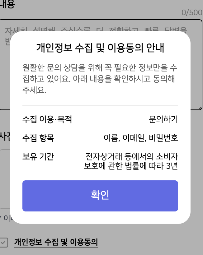
[Page1]
<Modal
  title="개인정보 수집 및 이용동의 안내"
  desc="원활한 문의 상담을 위해 꼭 필요한 정보만을 수집하고 있어요. 아래 내용을 확인하시고 동의해주세요."
  size="lg">
  <div className={styles.privacy}>
    <dl>
      <dt>수집 이용·목적</dt>
      <dd>문의하기</dd>
    </dl>
    <dl>
      <dt>수집 항목</dt>
      <dd>이름, 이메일, 비밀번호</dd>
    </dl>
    <dl>
      <dt>보유 기간</dt>
      <dd>전자상거래 등에서의 소비자 보호에 관한 법률에 따라 3년</dd>
    </dl>
  </div>
  <Button type="button" color="primary" size="lg" radius="radius">
  확인
  </Button>
</Modal>
{props.children} 안의 내용은 className={styles.privacy}.
모달 크기는 위 Scss에서 스타일을 주었던 .lg 를 넣어 작성해주었다.
size="lg"
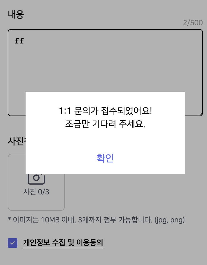
[Page2]
<Modal size="md">
  <div className={styles.success}>
    1:1 문의가 접수되었어요!
    <br />
    조금만 기다려 주세요.
  </div>
  <Button type="button" color="reversal" size="lg" radius="radius">
  확인
  </Button>
</Modal>
Page2 모달의 경우, 타이틀과 디스크립션이 없기에 생략해 주었고,
모달 크기는 위 Scss에서 스타일을 주었던 .md 를 넣어 작성해주었다.
size="md"
{props.children} 안의 내용은 className={styles.success}.